Raven maps come in a number of styles, but most of our maps feature "elevation tints," a sequence of colors corresponding to altitude ranges.
Our early maps were based on U.S. Geological Survey contours at 500-foot intervals, so the intervals were sharp boundaries, and each color was distinct from the next. In the digital age, we use continuous color shifts. It's a more realistic portrayal of elevation shifts, but it makes it harder to tell exactly what elevation range any specific place on the map occupies.
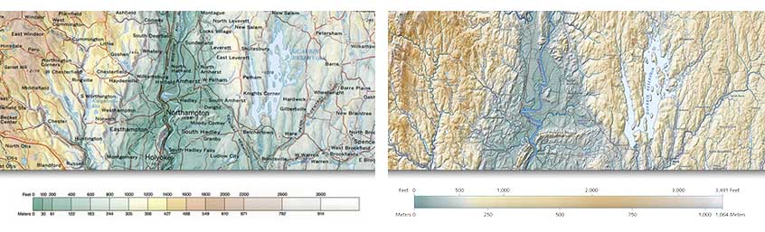
The piece above compares the delineated color bar from our New England map (left) to our new map of Massachusetts (right).
We use a very similar sequence for all of our elevation tint maps. This "color ramp" is an adaptation of a convention that arose in Europe in the late 19th century. Low elevations use a progression of greens, giving way to yellows, then tans and browns at higher elevations. The colors were more or less appropriate for a northern European summer, where low elevations are green in summer, and higher regions fade earlier in the fall.
As lithography improved, refinements crept in, with more subtle color gradients and progressively lighter grays-to-white for the highest elevations. That color scheme happily suggests snow peaks, but, overall, there is really no reliable correspondence to nature. The conventional sequence is positively backwards for many low-lying desert regions. We keep using it because it seems to convey a sense of elevations more intuitively understandable than any alternative we've found (and we've tried many). For map colors that come closer to the real landscape, try our Land Cover series - but that a topic for another day.
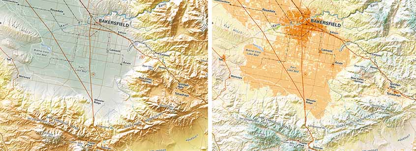
This comparison (above) shows the color difference between elevation tints of the Bakersfield, California area (left) with the land cover version of the same area (right).
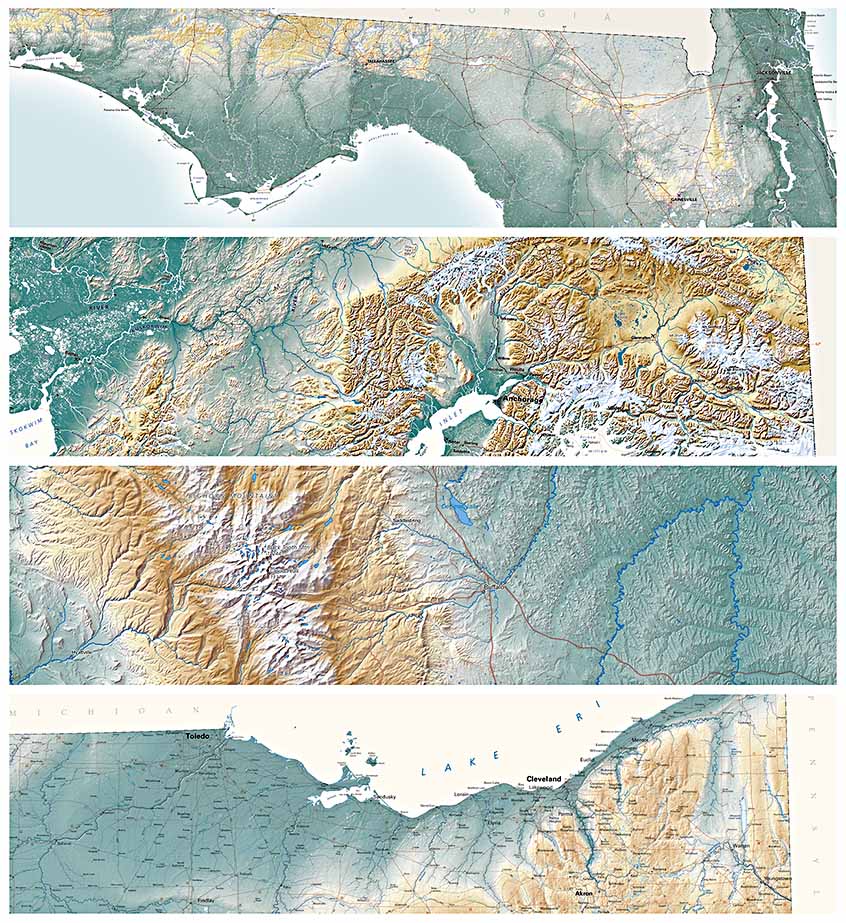
Colors represent relative elevations - the darkest greens are used for the lowest elevations within the area mapped. But, the lowest areas of Wyoming are far higher than the highest parts of Ohio. The color ramps themselves are similar across the series, but their respective real-world equivalents can range very widely. Florida has a total elevation range of about 340-feet, so its landforms require color shifts at very tight intervals. Alaska's elevations reach 20,000-feet (though most of the state is low); Wyoming ranges from about 3,500-feet to almost 14,000-feet, and Ohio ranges from around 850-feet to 1,450-feet. On the comparison below, the states, in order, are Florida, Alaska, Wyoming, and Ohio
In summary, all maps may use the same general hues, but the color breaks are custom-tailored for each.
